Valerio Biscione
Personal Website
Getting started with Conditional Random Fields
This is the first of a series of post that I am going to write about Conditional Random Fields. I am recently following the excellent Coursera Specialization on Probabilistic Graphical Models (the videos for each course are freely accessible), and I found the topic really interesting. However, I felt that the time dedicated to Conditional Random Fields (CRF from now on) was decisively short, considering that this (and the evolution of this) model is been using in several applications nowadays: apart from the classic Part-of-speech tagging, it is used in phone recognition and gesture recognition (note that in this work Hidden Conditional Random Fields are used, a model which we will talk about in a future post)
Of course, this is not the only introduction on the internet that you can find on CRF: Sutton and McCallum wrote a excellent article (here), and another introduction can be found in Edwin Chen blog (here). However, Sutton and McCallum article appeared to me to be too hard for a novice that just started in the field; Edwin Chen blog assumes some knowledge of graphical models, and does not provide any code. Conversely, this gentle introduction will not assume any knowledge on probabilistic graphical model (but it does assume some basic of Probabilistic Analysis), and will provide some code for solving a simple problem that we all face: how can we tell if our cat is happy? By using Conditional Random Fields, of course!
I will use Python as a language of choice, with the nice pgmpy library. Installing pgmpy was completely painless, (just follow the instructions!). This guide is not going to be a formal introduction (for that you have many other sources you can dig in), but an informal, aimed more to convey the insight behind the model than to be mathematically precise.
So, what are Conditional Random Fields?
Let's make some classification. Conditional Random Fields is a type of Markov Network. Markov Networks are models in which the connection between events are defined by a graphical structure, as shown in the next Figure.
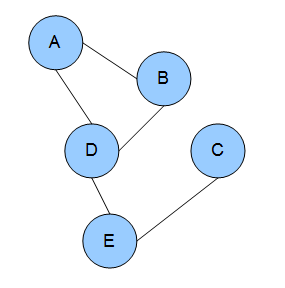
Each node represents a random variable, and the edges between nodes represent dependency. With Markov Networks is very convenient to describe these dependencies using factors ( ). Factors are positive values describing the strength of associations between variables. I know what you are thinking: are these probabilities? Or conditional probabilities? Nope, nope, they are not*, and in fact they are not bounded from 0 to 1, but can take any positive value (in some cases they could be equivalent to conditional probabilities, but this is in general not true).
CRF are defined as discriminative model. These are models used when we have a set of unobserved random variables Y and a set of observation X, and we want to know the probability of Y given X. Quite often we want to ask a different question: what are the assignment to the Y variables that most likely generated the observations X? In particular, CRF are very useful when we want to do classification by taking into account neighboring samples. For example, let's say that we want to classify sections of a musical piece. You know that different sections are related, as there is a very strong chance that the exposition will come after the introduction. Well, CRF are perfect for doing that, as you can incorporate these knowledge in them. Not only! You can also incorporate arbitrary feature describing information that you know exists in the data. For example, you know that after a certain chord progression, you are quite likely going into the development section. Well, you can introduce that info as well in your model.
But for now, let's drop this music nonsense, and let's talk about something unquestionably more stringent:
Is your cat happy?
Everybody loves cats. They are cute, fluffy, and adorable. Not everybody knows how to tell if a cat is sad or happy. Well, you will soon be able to, with a little help from your friendly Conditional Random Fields!

Let's say that you have a very simple cat, Felix. He won't experience complex emotions such as anger, joy, or disgust. He will just be "happy" or "sad". You read on your favourite cats magazine that cats express contentedness with "purrs". However, some time, "purrs" may be expression of tensions. Felix, begin a simple cat, doesn't know what those words mean, and he uses "purrs" for expressing happiness or sadness.

We are going to observe Felix several times a day, and every time we are going to notice if he is purring or not. This will be our observation vector  . We know that our observation can tell us something about Felix's internal state at each time
  (let's call this set
  ). So, if we observe that Felix is purring at this moment, we can more or less confidently say that Felix is happy. Pretty simple, right? Now is where it gets interesting.
The important concept about Conditional Random Fields is that we can also specify dependencies between unobserved states. For example, we may know that our Felix is a pretty relaxed cat: his emotional states are quite stable, and we know that if at some point in time he was happy (or sad), he will most likely be happy (or sad) at the next point in time. On the other hand, we may know that our Felix is an histrionic diva, changing his mind at the blink of an eye. We can model this relationship as well.
With this information, we can build our graph:

As explained, are the observation, and each  is connected with Felix internal state (
 ) at time
  . The internal states are also connected in pair. In this and the following example we are going to observe Felix 3 times (
 ). Notice that each state is only affected by the previous one (our Felix doesn't seem to care about his internal state long time ago, but he is only affected by what he was feeling recently). This simple network is called a linear CRF.
Now we also have to come up with some idea about the relationship between Felix's purring and his level of happiness. Let's say that we come up with this table:
The values are in an arbitrary scale, and they indicate the "strength" of the relationship. Note that these are not probabilities. To emphasise that, I didn't scale those from 0 to 1 (but your are free to do so). From the table we can see that Felix can express his emotion more strongly when he is purring. If he is purring, we can be say quite surely that he is happy. If he is not purring, we can say that he is sad, but the strength of this belief is not so strong: we are convinced '25' [whatever scale that is] that he is sad, and '15' that he is happy. We will call this factor 
Now we have to specify the transition probability: if Felix is happy now, what's the chance that he is going to be happy later on? For the time being, we want to ignore this dependency and just get everything to work, so we will build this uninformative transitional matrix
(notice that the value can be anything, as far as it's the same for each entry in the table). The row variables indicates the emotional state at time ; the  the emotional state at time
  . We will call this factor
  . This is how the network looks like with the factors:
Let's see how we can implement this in Python. We are going take 3 measures for now, so our network will only have 3 unobserved states and 3 observed states:
[to run this code you need Python2.7, pgmpy, and numpy]
from pgmpy.models import MarkovModel
from pgmpy.factors.discrete import DiscreteFactor
import numpy as np
from pgmpy.inference import BeliefPropagation


def toVal(string):
    if string=='purr':
        return 0;
    else:
        return 1;

catState=['happy','sad']
MM=MarkovModel();
# non existing nodes will be automatically created
MM.add_edges_from([('f1', 'f2'), ('f2', 'f3'),('o1','f1'),('o2','f2'),('o3','f3')])

#NO DEPENDENCY
transition=np.array([10, 10, 10, 10]);
#RELAXED CAT
#transition=np.array([90,10,10,90]);
#DIVA CAT
#transition=np.array([10, 90, 90, 10]);


purr_happy=80;
purr_sad=20
noPurr_happy=15;
noPurr_sad=25;

factorObs1= DiscreteFactor(['o1','f1'],cardinality=[2, 2], \
values=np.array([purr_happy, purr_sad, noPurr_happy,noPurr_sad]))
factorObs2= DiscreteFactor(['o2','f2'],cardinality=[2, 2], \
values=np.array([purr_happy, purr_sad, noPurr_happy,noPurr_sad]))
factorObs3= DiscreteFactor(['o3','f3'],cardinality=[2, 2], \
values=np.array([purr_happy, purr_sad, noPurr_happy, noPurr_sad]))

factorH1= DiscreteFactor(['f1','f2'],cardinality=[2, 2], values=transition)
factorH2= DiscreteFactor(['f2','f3'],cardinality=[2, 2], values=transition)


#factor.values
MM.add_factors(factorH1)
MM.add_factors(factorH2)
MM.add_factors(factorObs1)
MM.add_factors(factorObs2)
MM.add_factors(factorObs3)
Note the peculiar way of inserting the entry for each factor. We take the conditional probability table, starting from the first row, and we proceed from left to right before going to the next row. We can have a more friendly representation by calling factorObs1.values(). If you are wondering what does cardinality means, it's just the number of values that each variable in the factor can take. In our case, we are working with binary variables, so cardinality will always be 2.
Now we are going to do some magic. By using an inference algorithm called Belief Propagation we will be able to estimate the probability of each internal state. However, we are not exactly interested in that, but we want to know what is the most likely internal state given our purring observations. The procedure for this is called MAP, and there are different ways of implementing that. We are going to use the MAP included in the Belief Propagation algorithm. Notice how in the code we specify what are the values of our observed variables (evidence=...). The function toVal maps "purr" to the entry 0 and "no_purr" to the entry 1.
belief_propagation = BeliefPropagation(MM)
ymax=belief_propagation.map_query(variables=['f1','f2','f3'],\
evidence={'o1' : toVal('purr'), 'o2' : toVal('no_purr'), 'o3' : toVal('purr')})
#ymax=belief_propagation.map_query(variables=['f1','f2','f3'],\
#evidence={'o1' : toVal('purr'), 'o2' : toVal('no_purr'), 'o3' : toVal('no_purr')})
#ymax=belief_propagation.map_query(variables=['f1','f2','f3'], \
#evidence={'o1' : toVal('purr'), 'o2' : toVal('purr'), 'o3' : toVal('purr')})

print('f1: ' + str(ymax['f1']) + ' = ' + catState[ymax['f1']]);
print('f2: ' + str(ymax['f2']) + ' = ' + catState[ymax['f2']]);
print('f3: ' + str(ymax['f3']) + ' = ' + catState[ymax['f3']]);
In our case, we observed a sequence of purr, no_purr, and purr again. As we have not specified any dependencies between states, the network is going to tell us that our cat was happy, sad, and happy again. Is this the case, though? Let's take a more realistic approach to this fluffy problem.
Felix as a cool, relaxed cat
Let's consider the first case: Felix is a cool dude, and when he is in a state, he is probably going to stay there for quite long time. We are going to use this transition factor table:
Which clearly tell us that there is a strong connection between being happy (or sad) at time , and being happy (or sad) at time . To generate this network, uncomment line 22 (from the first snippet), and run the script again. What is going to happen now? All the three states are now classified as "happy"! The lack of purr in the middle state, being less strongly connected with his level of happiness, has been overcome by the neighbour states, which more surely indicates that Felix was happy.
Try instead to set the sequence  (uncomment line 4 and 5 from the second snippet). What's happening now? Think about what the network is computing, and check if it makes sense.
Felix as a diva
Let's consider the situation where Felix is a diva, and he is more likely to change his mood along different observations. We can represent this by using the following transition table:
Which favours transition from sad to happy or from happy to sad. Now let's say that we observe our Felix purring all the time. Being him a crazy diva that he is, can we infer that he is indeed happy all the time? No way! In fact, if you uncomment line 25 from the first snippet and line 6 and 7 from the second snippet, and you will see that even though the observed sequence is  , the most likely state appears to be
  . Oh Felix, you are driving me crazy!
This simple example shows only the basics of the potential of CRF. This is only the beginning. We may want to automatically calculate the transition table, given the observation. Or we may want to include more complicated observation, or generate a non-linear graph. We can do all of this and much more with CRF.
In the next post I hope to use more complicated models to show other cool features of this approach. Hope you enjoyed it!

How to use dlib to QtCreator on Windows/Linux
Dlib is a nice C++ library for machine learning that also includes some good implementation of computer vision algorithm like the real-time pose estimation, that OpenCV strangely does not have.
Using Dlib is not so difficult, as is a "header-only" library and then you don't need to compile it. However, as it took me some time to figure out the correct steps to integrate it with OpenCV for Windows and Linux, I write this short post as a quick-rough guide to get it started.
Download Dlib and extract the folder somewhere. In windows, I used C:\, in Linux /home/username on Linux. Open Qt Creator and select "Qt Console Application". Once the files are generated, go to the .pro file of your project, and add
win32{
INCLUDEPATH += C:\dlib-18.18
LIBS+= -lgdi32 -lcomctl32 -luser32 -lwinmm -lws2_32
}

linux{
INCLUDEPATH += /home/<em>username</em>/dlib-18.18
LIBS += -pthread
CONFIG += link_pkgconfig
PKGCONFIG += x11
}
[extra libraries are required only for the gcc compiler, the others should add them automatically]
Then, right click on the "Sources" folder of your project, and select "Add Existing File", and add dlib-18.18/dlib/all/source.cpp
That's it! Now let's have some random dlib code and see if it works:
In main.cpp, add #include <dlib/image_processing/frontal_face_detector.h> on top. Comment everything inside the main and add, instead
dlib::frontal_face_detector detector = dlib::get_frontal_face_detector();
this doesn't mean much, but it's just to try and see if it works. Now run qmake, and build everything. It should build without any error. You can run it, and use all the Dlib capability for your software.
Head Tilting Detection - Automatic Page Turner for Pianists
Head Tilting Detection (or Automatic Page Turner for Pianists, still undecided about the name 😛 ) is a simple software that emits a Page Down/Up keypress when the user is tilting the head.
Since I started learning piano, more than 10 years ago, I had the problem of turning pages. Turning pages is one of the most annoying thing for a pianist: it forces you to waste seconds, interrupt the flow of music, and it affects the way we learn the pieces (e.g. by making the connection between pages really poor, since we usually stop from a page to the next). Several alternatives exist for turning pages automatically, but they are clumsy and inefficient. Recently I thought about applying my programming knowledge to this purpose.
As more and more pianists are switching from paper to digital scores, it is possible to use a machine learning approach. I designed a simple software that detects when you are tilting your head right/left, and "scroll" down the page accordingly by simulating a page down/up keypress, with in most software will scroll the window down/up - in Adobe PDF, if you "fill one full-page to window", you will turn a whole page (to next/previous one).
Update 28/03/2016: New version for Linux released. You can now rotate/flip your webcam viewer. The sound now works on Windows machine.
WINDOWS 32/64bit (tested on Windows 7, Windows 8, Windows 8.1)
Download Head Tilting Detection (no setup required) - for Windows
LINUX (tested on Ubuntu 15.10)
Download Head Tilting Detection (no setup required) - for Linux
open folder in terminal and type sudo ./HeadTiltingDetection.sh. This bash file will download and install xdotool if not installed already) and the software will be executed.
Instructions
Open the software, wait for the your face to be detected (a green rectangle around your face should appear), then wait for your eyes to be detected (red squares).
At this point select the application you want to send the keypress (for example, a pdf file).
When you tilt the head on one side, the corresponding arrow key signal will be emitted. A green circle should appear on the corresponding side of the camera view, and you should hear a specific sound for the direction you are tilting your head (you can disable the sound).
Adjust the threshold from the slider, disable the sound, or pause the detection from the user interface.
Key points
- The software is designed for pianists, so with more or less constant level of light, by taking into account slow/random movement, and by considering that pages are usually not turned so often. Plus, instead of just "turning" your page, it will scroll down on the page, with in most of the cases is what you want.
- For now, the software does not work if you wear glasses. I will maybe work on this in the future.
- The software uses a Haar feature-based cascade classifiers, with template matching for tracking the eyes, and several heuristics to increase accuracy. A cubic function of the two eyes' degree is used to emit the keypress. The threshold for the keypress can be adjusted.
The software has been tested on Windows 7, 8, 8.1. For now there is only a Window version, but I may develop it for other platform in the future.(28/03/16) Linux: Ubuntu version released
Future work
The software is not perfect. Unfortunately, I do not have many hours to dedicate to it. I plan to keep work on it, but not consistently. I'll probably add to this post any minor updates, and create new posts only if there is a major improvement. If you want to collaborate with me for this project, feel free to contact me!
The software uses OpenCV (for the computer vision part) and Qt. It was very nice working with Qt again after so long, and discovering OpenCV was also very interesting. I have a very good opinion about both in terms of usability and capability. Managing to merge both systems was an excellent experience for me.
plotLineHist: when summary statistics are not enough.
Today I am going to show one of my function that I am using quite extensively in my work. It's plotLineHist and that's what it produces:
 Well, what the heck is that? PlotLineHist take a cell array C, a matrix M, a function handle F, and several optional arguments. The cell array C is a nxm. You have to think of each row as being an experimental condition for one factor, and each column as the experimental condition for a second (optional) factor. The matrix M specifies the values for the row's factor ( λ in the figure). In the figure, each column's factor is represented by different colours.
PlotLineHist execute the function F (for example, @mean) for each cell of the cell array, plotting the resulting value and connecting the row's (continuous lines in the figure). It also calculates the standard error for each cell (vertical line on each marker).
However, the novelty is that it also plot a frequency distribution itself for each condition, and aligns it vertically on each row's factor. The distribution's value corresponds now to the vertical axis of the figure.
Each row distribution has a different colour. The first row's distribution is plotted on the left side, the others on the right (of course, having more than 3 row's condition will make the plot difficult to read, but it may still be useful in those cases).
If this sounds convoluted, I am sure you will get a better idea by a simple example.
Let's say that we are measuring the effect of a drug on cortisol level on a sample of 8 participants. We have just 1 factor, the horizontal one, which is drug dose: let's say 100mg, 200mg and 300mg. The cortisol level is found to be:
| Patient N. | 100mg | 200mg | 300mg |
|---|---|---|---|
| 1 | 10 | 15 | 20 |
| 2 | 12 | 16 | 23 |
| 3 | 13 | 14 | 15 |
| 4 | 13 | 14 | 15 |
| 5 | 20 | 17 | 20 |
| 6 | 50 | 30 | 21 |
| 7 | 12 | 15 | 19 |
| 8 | 14 | 14 | 23 |
Since we have only one factor, we need to put all the data in the first row of the cell array feed into the plotLineHist function:
p{1,2}=[15 16 14 17 30 15 14 16];
p{1,3}=[20 23 15 20 21 19 23 23];
plotLineHist(p, drugDose,fun);

The blue line with the markers indicates the mean response for each condition (with standard error). But then we also have a nice plot on the distribution for each condition! This allows us to spot some clear outliers in the first two distributions.
Now, let's say that we have two factor. For example, sometime the drug is taken together with another substance, and sometime is not.The drug is still given in 3 different dosages, 100, 200 and 300mg.
%example 2
%without substance A
p{1,1}=[10 12 13 20 50 12 14 12];
p{1,2}=[15 16 14 17 30 15 14 16];
p{1,3}=[20 23 15 20 21 19 23 23];
%with substance A
p{2,1}=[12 12 12 21 60 13 11 15];
p{2,2}=[16 16 14 18 31 19 18 17];
p{2,3}=[22 23 17 20 21 20 23 23];
drugDose=[100 200 300];
fun=@nanmean;
plotLineHist(p, drugDose,fun)

You can see how the second row condition distribution is positioned on the right side, so that the two distributions can be easily compared. Note how must of the nitty-gritty details are automatically calculated by the functions, such as bin width, scaling factors, etc. However, you have the chance to change it manually by using the optional arguments.
For me, this has been a very useful plot to summarize different types of information at the same time, without having a lot of figures.
Try it out and let me know!
LISP neural network library
This is a neural network library that I coded in Lisp as a toy-project around 2008. I post it here just for historical purposes. I do not plan to mantain the library in any way.

Diffusion Music
This is a little thing that I have done some time ago and never really got time to polish and publish the way I wanted, but it is still nice to put it out there.
This scripts generates X decision processes with some parameters and transform them in music. This just answer to the question that, for sure, every one of you is asking himself: how does a diffusion process sound like? And the answer is: horribly! As expected 😉
To code it, I used the nice library of Ken Schutte to read and write MIDI in MATLAB.
In the code, you can change the number of "voices" used (the num. of diff. processes), or the distribution of drift rate, starting tone , starting time, and length for each voice. Play around with this parameter and try to see if you can come up with anything reasonable. I couldn't!
The script also generate a figure representing the resulting voices (still thanks to Ken library), that may look like this:

As usual, you can download the file from here.
Quantile Probability Plot
In this post I will present a code I've written to generate Quantile Probability Plots. You can download the code from the MATLAB File Exchange Website.
What are these Quantile Probability Plots? They are some particular plots very used in the Psychology field, expecially in RT experiments when we want to analyse several distributions from several subjects in different conditions. First of all let's see an example of a quantile probability plot in the literature:

(from Ratcliff and Smith, 2011)
As explained in Simen et al., 2009
"Quantile Probability Plots (QPP) provide a compact form of representation for RT and accuracy data across multiple conditions. In a QPP quantiles of a distribution of RTs of
a particular type (e.g., crrect responses) are plotted as a function of proportion of responses of that type: thus, a vertical column of N markers would be centered above the position 0.8 if N quantiles were computed from the correct RTs in a task condition in which accuracy was 80%). The ith quantile of each distribution is then connected by a line to the ith quantiles of othe distribution."
For example, in the graph presented we have four counditions. From the graph we can extrapolate the percentage of correct responses to be around 0.7, 0.85, 0.9 and 0.95 (look at the right side). For each one of this distribution we computer 5 quantiles, plotted against the y axis (in ms). In the left side we have the distributions from the same conditions, but for the error responses!
With my code you can easily generate this kind of graph and even something more. Let's see how to use it.
First of all, you need to organize the file in this way: first column has to be the dependent variable (for example, reaction times in our case); second column the correct or incorrect label (1 for correct, 0 for incorrect); third column, the condition (any float/integer number, does not need to be in order). This could be enough, but most of the time you want to calculate the average across more than one subject. If this is the case, you need to indicate another column with the subject number.
The classic way to use it is just call it with the data:
quantProbPlot(data) will generate:

We may want to put some labels to indicate the conditions. In this case we ca use the optional argument 'condLabel': quantProbPlot(data,'condLabel',1) will generate:
(for this and the following plots, the distributions will always look different just because everytime I generated a different sample distributions!)
This is only the beginning. In some papers they plot the classic QPP with a superimposed scatter plot of individual RTs in each condition. A random noise is added on the x axes to improve redeability. Example: quantProbPlot(data, 'scatterPlot',1):

Nice isn't it? I also elaborate some strategies to better compare error responses with correct responses, through two optional parameters. One is "separate" and the other one is "reverse". Separate can take 0, 1 or 2, whereas reverse can only take 0 or 1 and works only if separate is >0.
Generally, separate=1 separaters the correct responses with the incorrect one in two subplots, whereas separate=2 plot the correct and incorrect with two different lines. This is usually quite useless, for example:

however, you can make it much more interesting when you combine it with reverse. Infact, if you call quantProbPlot(quantData,'separate',2,'reverse',1) you will obtain this nice graph:

which allows you to easily compare correct and incorrect responses!
With all these options, you can play around with scatter plot, separating, labels etc. in order to easily analyse your data.
I include in the file also the Drift Diffusion Model file that I proposed last time. I used this file to generate the dataset I use to test the Quantile Probability Plot code. For some example, open the "testQuantProbPlot", also included in the zip file.
scaleSubplot, to organize your subplot nicely
In psychology we often deal with data from several subjects, each subjet having several datapoints across more than one condition. Showing the results of an experiment for individual subjects in order to get a meaningful insight understandment of the data could be quite tricky. A classic way of organizing the data consists of plotting each subject's result in a subplot, in order to have all the subject's data in a single figure. MATLAB function subplot is quite good for the task, even if more and more often I find myself using the tight_subplot function. Anyway, one problem is that the subplot axes does not have the same scale by default, and this decrease the redeability of the results.
MATLAB allows you to link different axes (namely different subplots) so that you can scale all of them at the same time (linkaxes). However, once that all the subplots have the same scale, showing the axes label for each subplot seems a little bit redundant. It would be sufficient just to show the axes of the bottom and left most panels. I coded a function that does exactly that.
scaleSubplot(fig, varargin) allows you to scale at the same time all the subplots of a figure. You can specify a custom scale or let the code decide a nice unique scale for all the subplots. You can decide to scale at the same time the horizontal and vertical axes, or only one of them. Let's look at some example.
The easiest way of using the function is: scaleSubplot(gcf). In this case you will scale both x and y axes, and the script will find the best xlimit and ylimit for all the subplots. The code will make sure that all the data will be visualized in the subplots.
Note how the redundant x/ylabels have been suppressed:

We can have more control on the image by specifying some optional arguments. For example, if we want to have the same scale only the x axis, we specify 'sameScale',{'x'}. Notice how the x labels on the intermediate subplots are suppressed, but all the y labels are still there, since they do not have the same scale. In the figure below we also specify a custom xlimit. If you decide to specify a custom limit, make sure that all the datapoints in all the subplot fall within you limits.

We can also specify only one of the boundaries for the axes limit, and leave the code decide for the other one. For example we can write scaleSubplot(gcf,'xlimit',[-Inf 40]) or scaleSubplot(gcf,'ylimit',[0 Inf]).
My function is expecially useful when we want to have a tight subplot. In this case, eliminating the intermediate axis can make the subplot much more readable. For example, I generate the image on the left side with tight_subplot(2,4,0.05), where 0.05 is the gap between subplots. However, with all the axes labels, the image is a mess. After a simple scaleSubplot(gcf) the figure looks much better.

Hope you enjoy it.
Drift Diffusion Model
You can find some information about the Drift Diffusion Model here. There are probably several versions of the Drift Diffusion Model coded in MATLAB. I coded my own for two purposes:
1) If I code something, I better understand it
2) I wanted to have a flexible version that I can easily modify.
I attach to this post my MATLAB code for the DDM. It is optimized to the best of my skill. It can be used to simulate a model with two choices (as usual) or one choice, with or without variability across trial (so it can actually be used to simulate a Pure DDM or a Extended DDM). The code is highly commented.
The file can be downloaded here or, if you are have a MATLAB account, here.
If you take a look at the code, you could get confused about the presence at the same time of the for loop and the cumsum function. The cumsum is a really fast way in MATLAB to operate a cumulative sum of a vector. However, in this case I have to sum an undefined number of points (since the process stops when it hits the threshold, and it is not possible to know it beforehand). I could just use an incredibly high number of points and hope the process hits the threshold at some point. Or I could use a for loop to keep summing points until it hits a threshold. Both these methods are computationally expensive. So I used a compromise: the software runs cumsum for the first maxWalk points,and, if the threshold has not been hit, runs cumsum again (starting from the end of the previous run) within a loop (it repeats the loop for 100 times, every time for maxWalk points). After some testing, this version is generally much faster than a version with only cumsum or only a for loop.
This is an example of the resulting RT distribution with a high drift rate (e.g., the correct stimulus is easily identifiable):

I will soon post an alternative version of this file. They are less efficient, but allow to plot the process as it accumulates, which is quite cool.
Swap line with line above/below with AutoHotkey
One of the thing that I enjoy more in coding is... coding fast. This probably release in my brain a great amount of adrenaline, and makes me thing that I am fantastically good, even when my coding is actually poor 😀
One way to increase speed coding is to use keyboard shortcuts. Instead of moving your hand from the keyboard to the mouse to do trivial task such as selecting a whole line or copy and paste something, one can just use shortcuts. However, different software environments may have different shortcut, or may miss some particular shortcut combination that you use in other environment.
For example, a really nice trick in Eclipse, Notepad++ and other editor is the possibility to swap the current line to the line immediately above or below it. Unfortunately, this option is not available in some environments, for example in MATLAB. Should we just give up? Well, NO.
This is when AutoHotkey comes into play. This is a fantastic software that allows us to create script and macro to remap keystroke and action on the computer. The potential of AutoHotkey is huge, and in this post I will just show one example, coding a little script to swap the current line with the line above or below, exactly like in Eclipse or Notepad++. But, this time, the shortcut will work in every environment! 🙂
Once AutoHotkey is installed on your computer (and will not take much, since the software is also extremely light), right click on the little icon on the startbar and select edit script. Then, just copy and paste the following script:
#ifwinactive, AutoHotkey.ahk - Notepad

~^s::
reload
return

#ifwinactive

LWin & Q::
if GetKeyState("LControl","P")=1
{
Send {Home}
Send {LShift Down}
X=%A_CaretX%
Y=%A_CaretY%
Send {End}
if (A_CaretX=X and A_CaretY=Y)
{
Send {Up}
return
}
Send {LShift Up}
Send ^x
Send {Up}
Send {Home}
Sleep 10
Send ^v
Sleep 10
X=%A_CaretX%
Y=%A_CaretY%
Sleep 10
Send +{End}
if (A_CaretX=X and A_CaretY=Y)
return
else {
Send ^x
Send {Down}
Send ^v
Send {Up}
Send {Home}
return

}

}

LWin & A::
if GetKeyState("LControl","P")=1

{
Send {Home}
Send {LShift Down}
X=%A_CaretX%
Y=%A_CaretY%
Send {End}
Send {LShift Up}
Send ^x
Send {Down}
Send {Home}
Sleep 10
Send ^v
Sleep 10
X=%A_CaretX%
Y=%A_CaretY%
Send +{End}
Sleep 10
if (A_CaretX=X and A_CaretY=Y)
return
else {
Send ^x
Send {Up}
Send ^v
Send {Down}
Send {Home}
return
}
}
Press ctrl+s, which will save and reload te script. That's it! You just bound the two combinations CTRL+WIN+Q and CTRL+WIN+A to the up/down swap action.
Try it on any editor and enjoy your new shortcut!
If you want you can change the combination used if you don't like it or, for example, because they collide with another combination you use in some environment, just change line 9/10 and 51/52 with whatever combination you prefer (here a list)
Please consider that this is my very first script with AutoHotkey, so if the style is not so elegant take this into account 😛
I also use some other cool shortcuts that you might found interesting, but I will explore them in one of the next posts. Bye!